Break reminders are a good idea. But most of them are poorly executed.
They popup when you're typing, in a meeting, or watching a video. More often than not, they feel disruptive rather than helpful.
I know this because I’ve tried many of them - and eventually built one myself.
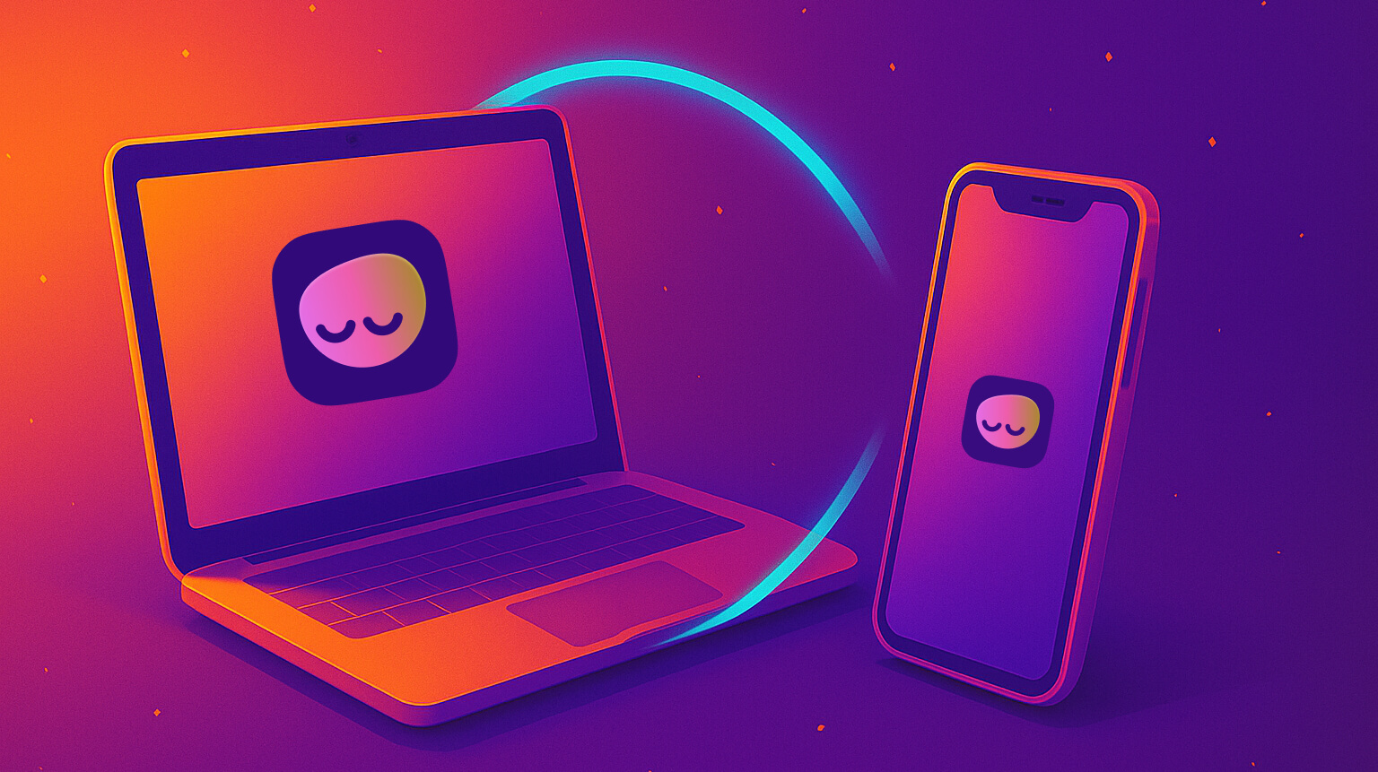
It's called LookAway. It’s a macOS app that reminds you to take breaks - brief pauses to stretch, blink, and reset. Over time, it’s grown to over 1,500 daily active users. No ads. No tracking. No popups asking for reviews. It grows because people tell each other about it.
But it didn’t start that way. The early version was annoying. Even I didn’t like using it. So I began fixing it - one interaction at a time.
In this article, you’ll learn:
- Why most break reminders fail (and how they annoy users)
- How LookAway uses context-aware logic to avoid bad timing
- Design decisions that make breaks feel natural, not forced
- Why control and subtlety matter more than flashy features
- Lessons learned from building a respectful, mindful app
The problem with most break reminders
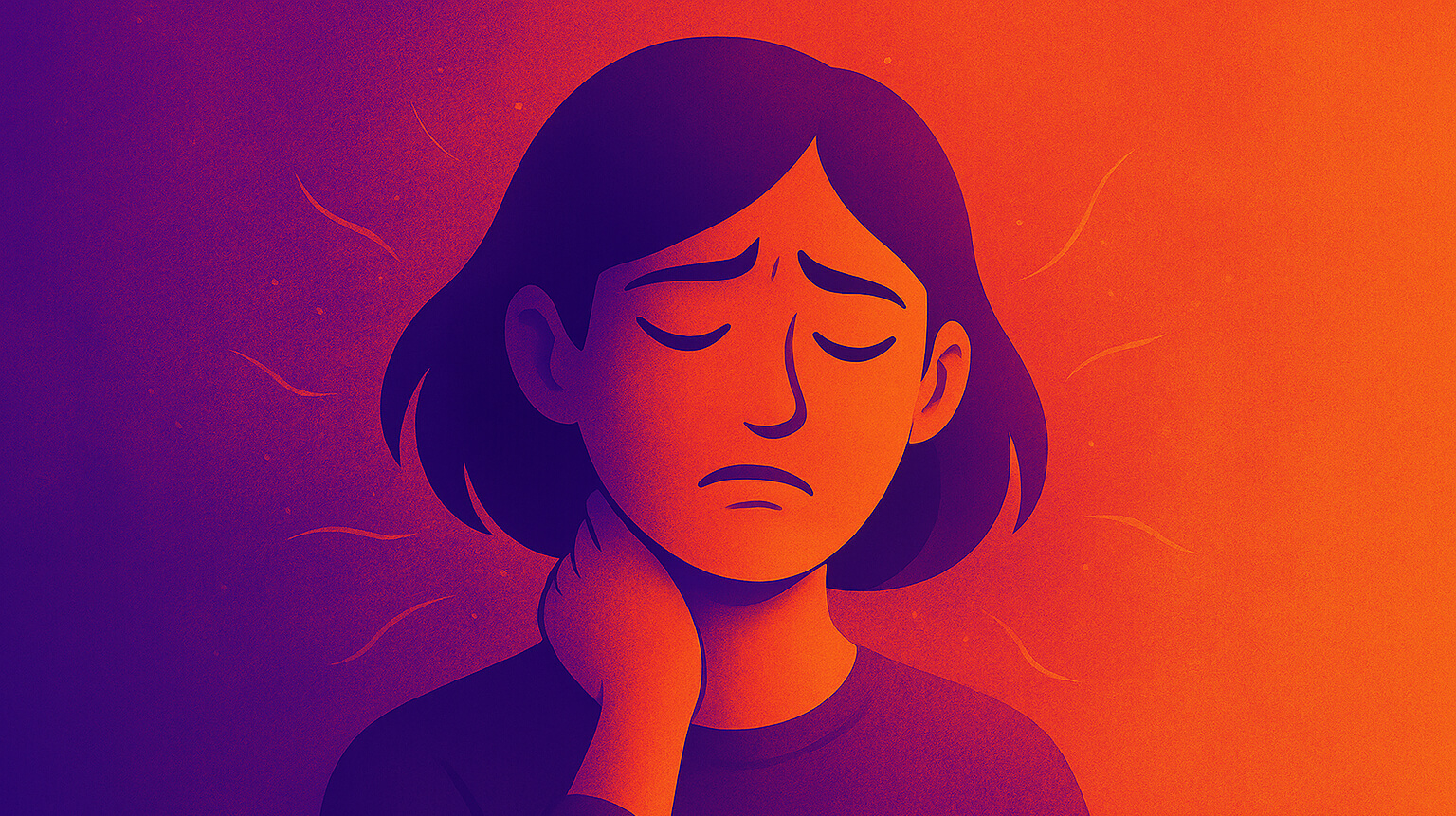
Most of the break reminders interrupt you without context. They work on simple timers. You set a break interval, and when the time is up, they block your screen. You could be typing an important message, or in a meeting, or watching a video, or finishing up a task after a long call. The break prompt doesn't care. It just shows up. That feels more like a nag, and less like a nudge. And it often leads to people getting frustrated and uninstalling the app.
So I changed the way LookAway works.
How I designed to make it better
I started thinking of breaks not as timers, but as interruptions. And the only good interruptions are the ones you don’t mind.
This is the part that took the most time - and taught me the most. I didn’t just want to “add features.” I wanted to remove friction. Make interruptions feel like part of the flow, not a disruption. These are some design considerations and principles that went into the development of LookAway.
1. Don't interrupt without context
This was the first issue I tackled because, as a user, it was the most annoying. Here are some of the things I added which made a huge difference:
During meetings, screen sharing, video playback, etc.
In the early days, many users reported frustration and concern when a break screen would appear during a meeting, or the moment a meeting ended - a classic example of interruption without context.
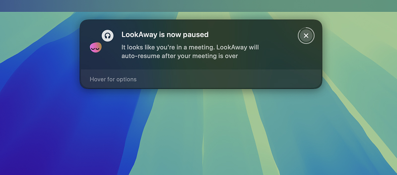
To solve this, I added mic and camera usage detection (thanks to this comment on HN for pointing me into the right direction). It assumes that if your mic or camera is actively being used, you're most likely in a meeting or a call. Once this is detected, it defers the breaks until the end of the call.
Also, just because your calendar says a meeting ended at 2:00 PM doesn't mean you're done. Maybe you're writing follow-up notes, or still wrapping up mentally. LookAway detects long periods of calls or meetings and gives you a short grace period before prompting a break. This respects the post-meeting transition time and avoids punishing you the moment you become 'available'.
I later extended this to detect and automatically pause during video playback, screen sharing, fullscreen gaming, and whitelisted apps.
During typing
When you're typing, you're usually in a flow state. It's the clearest signal of mental engagement - you're forming thoughts, expressing ideas, or replying with intent. Interrupting someone in this state is like tapping them on the shoulder mid-sentence. It breaks concentration.
LookAway monitors keyboard activity (with your permission of course) and detects when you're typing. If the break is due but you are still typing, it waits. Once typing stops, a short buffer is triggered before the break appears. This makes the experience feel more respectful and less like an interruption. It makes it feel like it's working with you, not against you.
2. Giving enough control
I wanted to make sure that people had enough control so they didn't feel like they were being dictated. No one likes that. People should be able to make new habits on their own terms.
Heads-up before the break
I hate getting interrupted mid-flow. Everyone does. So I added two layers of notice before a break.
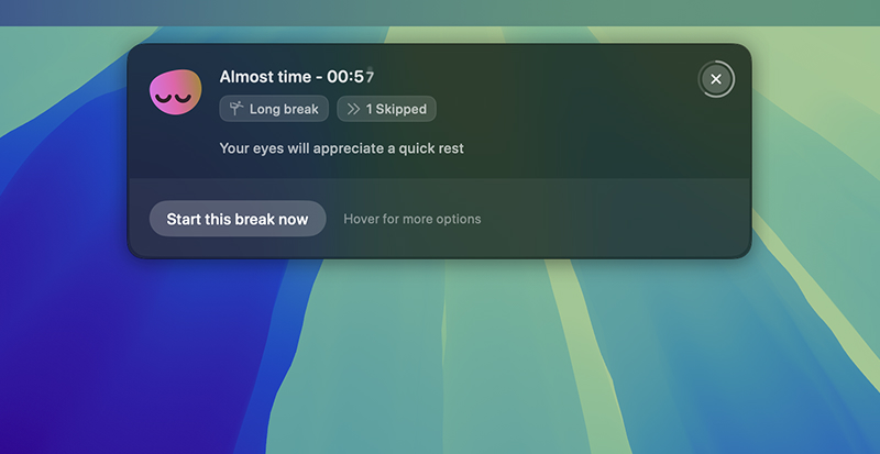
First, there's a subtle reminder at the one-minute mark that gently appears letting you know a break is coming soon. It's designed to be non-interruptive and it helps you mentally prepare.
Then, 5-10 seconds before the break, a small countdown appears that follows your mouse cursor (it's harder to miss). This gives you a clear and a calm heads-up that the break is about to begin.
Both of these combined give you time to finish what you're doing or mentally prepare to stop. It also creates a subtle sense of closure - your brain can “park” what you’re doing instead of being forcefully cut off. This is rooted in cognitive psychology, where abrupt task-switching increases mental fatigue.
Options to snooze or skip
Sometimes you are so deep into the flow that taking a break at that moment is out of the question. Maybe all you need is just five. more. minutes.
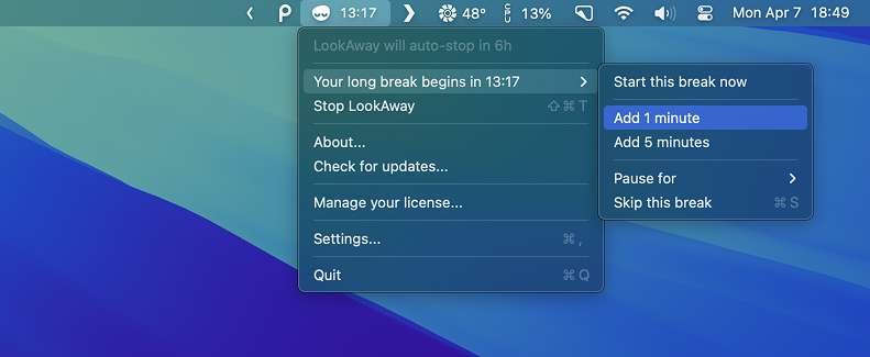
So to keep things simple, I added two options for delaying a break - postpone the break by 1 minute or 5 minutes. If you need more time than that, it might actually be a good moment to take the break - or you can choose to skip it entirely.
I realized that if you're forced into taking a break when you're not ready, the app feels like a dictator. And annoying. But when you’re given just a little flexibility, it feels like you're doing this for yourself. LookAway gives you that control without guilt - making breaks a choice, not a chore.
3. Aesthetics
As a native Mac app, it mattered to me that it felt at home on the system - with thoughtful aesthetics.
Animations and sounds
The break screen doesn’t shout for attention. It fades in. Animations move slowly, and sounds are soft and unobtrusive. The goal was to create a transition that feels like a soft exhale.
The sound design was inspired by a practice in Zen Buddhist monasteries. At regular intervals, a mindfulness bell rings. When it does:
- Everyone pauses what they’re doing
- They take a moment to breathe mindfully
- Then return to their work, but with more awareness
That’s the feeling I wanted LookAway to carry: a quiet nudge, a calm moment, and a smoother return. Later, I added an optional Tibetan bell sound after a user emailed me asking for it. I switched to that sound myself and haven't looked back since. Here's more about that update.
Design
I designed LookAway to be invisible.
As Jared Spool once said, "Great design, when done well, is invisible. If the user notices the design, it's not good enough yet". That line stuck with me.
When I was building LookAway, I kept asking myself: how do I make something that helps people without interrupting them? I didn’t want users to think “this app is well-designed.” I wanted them to not think about it at all.
This meant rethinking interaction patterns. No complex onboarding. No persistent UI. No unnecessary notifications. Just quiet nudges that feel native to the flow of the day. I leaned into defaults that made sense, and avoided excessive customization unless it added real value.
Good design shouldn’t show off - it should disappear.
Things I learned building this
Interruptions need empathy
It’s easy to interrupt someone. It’s hard to interrupt at the right time. Context matters. People are often focused - typing, in meeting, or winding down from one task before starting another. If your app can't tell the difference, it risks becoming background noise.
People like to be in control
No one likes to feel forced. If a break reminder shows up when you’re not ready, it feels like a power play. But when you can delay it, snooze it, or skip it entirely, the dynamic shifts. It’s your choice. You’re still being nudged, but gently - and that makes all the difference. Giving people simple controls helps them build a habit on their own terms.
If your app annoys you, fix it
This one’s simple. I was the first user of LookAway - and in the beginning, it irritated me. So I kept tweaking it. Every time something felt off, I didn’t assume users would tolerate it. I fixed it. If you’re building something and it bugs you even a little, trust that instinct. Your future users will thank you for it.
A little kindness goes a long way
The tone of your writing. The pace of your animations. The sounds you play. The way your app backs off when someone needs space. These small things stack up. They create a mood. A vibe. An app that feels kind becomes something people keep around - not just because it’s useful, but because it respects them.
That’s it. I just wanted to share what I learned making an app that gently gets in your way - for your own good. If you liked it, do give LookAway a try!
Try LookAway
LookAway is a smart break reminder that helps reduce eye strain, digital fatigue, and maintain better posture - so you can end your day feeling fresh.
Learn more